
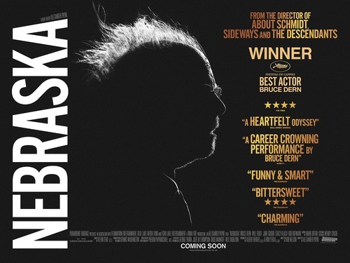
Synopsis | An aging, booze-addled father makes the trip from Montana to Nebraska with his estranged son in order to claim a million dollar Mega Sweepstakes Marketing prize. Starring Bruce Dern, June Squibb, Will Forte, Bob Odenkirk, Stacy Keach. Directed by Alexander Payne.
Nebraska is a very interesting movie to discuss in terms of the stylistic elements which are very specifically crafted to exude the thematic content of the story, which is a tale of simplicity. There are a plenty of great film reviews out there if you want a general feel for the content of the movie, story, acting, and all the usual suspects. However, I’m going to focus on some more intricate elements and give some thoughts on the use of black and white, the central acting performance and the theme of simplicity.
Black & White | The film presented in Black & White, despite being shot on one of the most advanced camera systems in the world, the Arri Alexa. It was a bold move by director Alexander Payne and one which was done to echo the film’s main theme of simplicity. Initially, Payne had wanted to shoot on black and white, 35mm film, but due to studio pressure, had to shoot in colour. The agreement was made to appease Paramount who had plans to release the film in both black and white and colour in selected cinemas, as part of a bigger marketing plan, obviously frightened by the prospect of losing any marketing leverage due to the lack of colour. However, after shooting, the film was granted a full black and white release and Payne is quoted as saying that he hopes the colour version ‘never sees the light of day’. Interestingly, the desire to shoot film was so great that he didn’t stop at simply converting the film to black and white, but added extra film grain to mimic the look of film as closely as possible. A clever navigation of the studio’s constraints to fulfill his artistic vision. Interestingly, the film grain wasn’t done through digital manipulation, but through shooting the actual grain on film stock and overlaying the layers, giving it as authentic a ‘film look’ as possible. Paramount obviously believed the black and white look would alienate audiences, but I think that it’s a masterstroke, and in a saturated release schedule with films clambering over each other to get the attention of audiences by shouting as loudly as possible, it’s the long, simple, black and white film that stands out as genuinely different. ‘That black and white film’ at the cinema, has certainly generated a massive talking point for cinemagoers. Further Reading on the black & white choice of the film HERE.
Bruce Dern |Bruce Dern as the protagonist Woody Grant, does a tremendous job and is well worth the ‘Best Actor’ award he received at Cannes Film Festival. He presents a fragile old man as both likeable and frustrating. We laugh at moments of unintentional comedy due to his blunt disposition, again, as a result of his brutal simplicity. Interestingly, when Dern was asked whether he believes his character is slow because of some form of dementia, an issue only addressed at the end of the film, that he does not. Before the mention of dementia in the dying embers of the film, it hadn’t even crossed my mind that it might be the case and, for me, the film does a good job of presenting his character as old but not ill. In that way, we don’t feel sympathy for the character out of pity because he has something wrong with him, but because of the nature of the character and this is credit to Payne and Dern for extracting an emotional reaction from their audience in a more intricate way than playing a pity card. It’s hard to properly connect to the character however, since no great backstory or motivations are exposed, but once again I think this is a deliberate move by the director, illustrating that not all characters have to have some great inner struggle, moral dilemma, hubris, catharsis or comeuppance. Some people are really very straightforward and there’s nothing wrong with that. It might well be a statement on movie culture and the over dramatisation of reality, or more globally, a statement on the high strung western way of life.
Deliberate Mediocrity | The movie is like a beautiful wallpaper, marvellously attractive but, hell, it’s still wallpaper. You’re not going to run around town yelling to people to go see it as you would had you seen a beautiful painting at a gallery but to all that happen to chance a pass by the house with the wallpaper, they will all attest to it’s beauty and elegance, but without the need to drag others to see it. At least that’s how I feel. There isn’t some deep, intricate message in the movie, it’s just a nice story to observe, one that doesn’t need hundreds of layers to unpack and assess. That’s not to undermine the strength of the film because I fully believe it was exactly intended to be like that in keeping with the brutal simplicity. Maybe in a way the film is too successfully executed in it’s deliberate mediocrity. Is it better to be a perfect wallpaper, hidden away and unseen or a spotlit painting, front and centre in a gallery, albeit imperfect but observed by the masses? At least the painting is seen, despite imperfections whereas the wallpaper in all it’s glory is hidden away. I argue that a successful film is one which tracks the intent of the director most closely and if, as I believe, Payne was intending all this brutal simplicity, then to hell with the masses, it’s about the lucky few that stumble upon this little gem.
Don’t expect big things, melodrama or twists and turns. The best way to watch this film is to be completely passive and give yourself over to the story, and simply observe the life of others. This film is about the simple life and the unselfish man with simple desires, so cast off the Westernised shackles of what you constitute as the good life, and watch somebody else live theirs, without judgment or bigoted, preconceived ideas.